
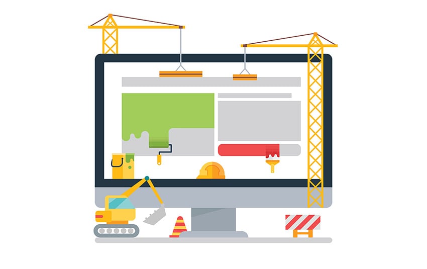
Many people who design and build a website to develop their business have the idea that by creating a site, the work is done and they can easily make money from it. It must be said that this is not true at all. Of course every site, after it is created, has a number of problems and mistakes. Some of these mistakes are not easy to detect and solve. Mistakes such as typography, design, technical problems, graphics and on. Common mistakes in Responsive Website Design is the most important of them. The importance of discovering and resolving this mistake is so great that if your goal is to make money, it can overshadow it and cause your site decline.
Responsive Website Design
The word responsive is a Latin word meaning reactive. A responsive site is a site that responds to page navigation on any type of device based on the size and resolution of that device. The changes included fit the screen. A responsive site is a site that responds to page navigation on any type of device based on the size and resolution of that device. The included changes is in accordance with the screen.
For example, suppose displaying a site on a personal computer is different from displaying a site on a mobile phone. If you open a site through your mobile phone and you have problems with the size and movement of the screen, that site is not responsive. The opposite is also true. On sites displayed with a mobile phone, if the size of the site fit a phone or tablet, and when you using its contents, you don’t have trouble in navigating to its different sides , this site is responsive. Keep in mind that being responsive is very important for sites.
The importance of responsive website design
In this day and age, everyone knows the importance of having a mobile device. It can be said that many successful online businesses are driven by mobile phones. On the other hand, many people who have access to these activities as an audience or customer, do so through their mobile phones. According to a worldwide study, about 50% of the world’s web traffic is consumed by mobile phones. This means that 50% of site visitors view the content on the site via mobile phone.
Now, if these sites are not responsive, the percentage of visitors and their audience will decrease rapidly. Because more than half of its audience has entered through mobile phones. Now that you know the importance of this issue and you are looking for ways to make your site responsive, it’s time about to address the common mistakes in responsive site design.

Common Mistakes in Responsive Website Design
In some cases, the site responsiveness doesn’t work correctly. Scaling, flexibility and responsiveness are the three main issues that should be considered in responsive site design. During coding a site, the coding should be such that by changing the screen size of the site, the dimensions of the site also change. These changes should not make in trouble in the readability of the content. Next, we will examine the common problems in responsive site design in detail.
Irregularity of the Menu
When a site has a menu or navigation bar and you want to view this site via phone or tablet, the site’s responsive designer should design this bar in such a way that some minor items are removed or added to it according to the screen. For example, on small screens such as phones, the letters in the menu do not have to be accompanied by a photo. Because the size of the image does not fit the page and causes confusion in the menu and ultimately confuses the user. Therefore, it is important to pay attention to the navigation bar and the information displayed in it in responding to the site.
Fixed images
On many sites, content is displayed along with photos. If we use a fixed-width image for the images used in the content of the site, the site responsive operation will be difficult. Imagine opening a site with a tablet and the content is all readable and tidy, but the image between the content and the titles is out of the box. This problem must be solved using unit ratio.
Improper placement of columns
Imagine what happens to the columns on the site by changing the size of the screen. With the slightest mistake, the whole order of the site may be disrupted due to incorrect placement of the columns. In most sites, the content is in columns. So it is better to fix this common mistake in the responsive version of your site.
Long content
Another problem that disrupts the site’s responsive process is the length of content on the site or ignoring the loading of site pages. Site titles and content should be very brief and concise. Reading long content and multiple titles on a small screen such as a mobile screen is difficult and causes eye strain and boredom in the visitor and audience of the site. To solve this problem, do not show all the content of the site to the audience at once. Instead, display a few key lines and use “read more” or “more” key. In this way, the user decides whether he intends to read more the title. In this way, you can easily provide several different articles to the user to read as he wants.

Website design for desktop
One of the most common mistake is that designers design the website for the desktop at the very beginning. Because they believe that it will be easy to turn it into a responsive design for other devices. But this mistake in the coding stage can become a big problem. This can cause rework and it can transfer errors to the next condition. Creating a mobile website may be time consuming or difficult at first. Because you are not used to this method yet.
Separate URL for mobile
Having a separate URL to display the site on a mobile phone can be a complete disaster, and it can undoubtedly be said that it fails the main purpose of a responsive design in the first place. . Finally, when users open the website with their mobile phone, it takes time for them to be shown the home page and it also seriously damages your search engine rankings. But there are definitely benefits for having different URLs. This way you can create mobile sites with lighter pages that perform better on smart devices. This way you can create mobile sites with lighter pages that perform better on smart devices. This site is also considered for viewing on specific operating systems. But unfortunately the negative points of having separate mobile URLs are more than the positive points and should be avoided.
Develop websites for touch phones
Most devices today have touch screens, even many laptops have touch capability. Therefore, it is important not to overlook the importance of touch control when creating a responsive design. Consider users’ finger size for clicks.
Concluding remarks
Performing responsive site design operations is very necessary. Because, as mentioned above, a very large percentage of site visitors visit sites through mobile phones and tablets. Being responsive or not has a direct effect on the visibility of the site. It is possible to spend a lot of money on graphic design and the main structure of the site, but the site is not well received. At this stage, the first problem that you should try to discover and find is the responsiveness of the site.


Leave feedback about this
You must be logged in to post a comment.