Every day, thousands of factors influence our moods, attitudes, choices, and decisions. For most people, color is one of the most powerful. Colors evoke human emotions instantly, create powerful images in our minds faster than we can comprehend. It is clear that site designers should be familiar with the psychology of colors in order to create a UI, both practical and emotional. In this article, we are going to examine the principles of color psychology and its effect on user behavior.
Although we have tried to compile a complete and comprehensive guide to color psychology in this article, but the topic is so broad that web designers are advised to take specialized courses to better master it.
What is the best color for web design?
Color psychology is the study of how colors affect our emotions and behaviors. As soon as we perceive color, our brain and endocrine (hormone-producing) system receives this input and releases hormones throughout the body. As a result, this unconscious interaction has a powerful effect on our emotions.
The Color Research Institute found that people unconsciously make judgments about an object, person, or environment within 90 seconds of initial viewing. Furthermore, an incredible 62% to 90% of this judgment is made based on color alone. Consequently, designers should study and understand the psychology of colors in UX design and UI design.
While color theory helps designers understand the nature of colors and create harmonious color combinations, color psychology deals with our minds and emotions. In addition, colors can not only attract the attention of users, but also retain users for longer than black and white images. As a result, colors increase the longevity of UX/UI design.

Why is Color scheme important on a website?
It is because the colors affect our emotions and decisions, duh! Why colors affect how people feel is not clear. There are a number of elements that can influence how a person feels when faced with a particular color. One of the important factors is the personal connection with a color. For example, if a person’s favorite stuffed animal was blue as a child, they may prefer blue throughout their lives. Or conversely, if the same person had an accident with a blue car as a child, he or she might have a strong negative emotional reaction to the color blue throughout their life.
However, due to universal human experiences, it is possible to predict how most people will respond to a given color. For example, the color green is often associated with nature and growth because most people have seen plants grow. Blue is almost universally relaxing because it is associated with things like sky and water. Other effects are cultural. For example, the color purple is still associated with luxury, as it was very expensive and rare in many ancient cultures and was therefore only used by royalty.
It’s not just mood and emotions that color psychology can influence. Color can also affect performance in very interesting ways. For example, in a study published in the Journal of Experimental Psychology, researchers found that the color red negatively affects performance. When participants were given a red number (rather than green or black), they performed 20 percent worse on the tests than those given other colors. This is a significant difference and can be used to influence the user experience. This does not mean that red will always hinder performance. In a study on athletic performance, red clothing appears to confer an advantage. During the 2004 Olympics, athletes competing in four different sports were randomly assigned blue or red protective clothing or equipment. The red-faced men won in 19 out of 29 weights.
questions to ask when applying color psychology in web design
now that you color affect our emotions, you can choose! but not so fast because there are some major questions you should ask yourself or your team.
• What are the main goals of the website?
• What are the products and services of the website?
• Who are the website users?

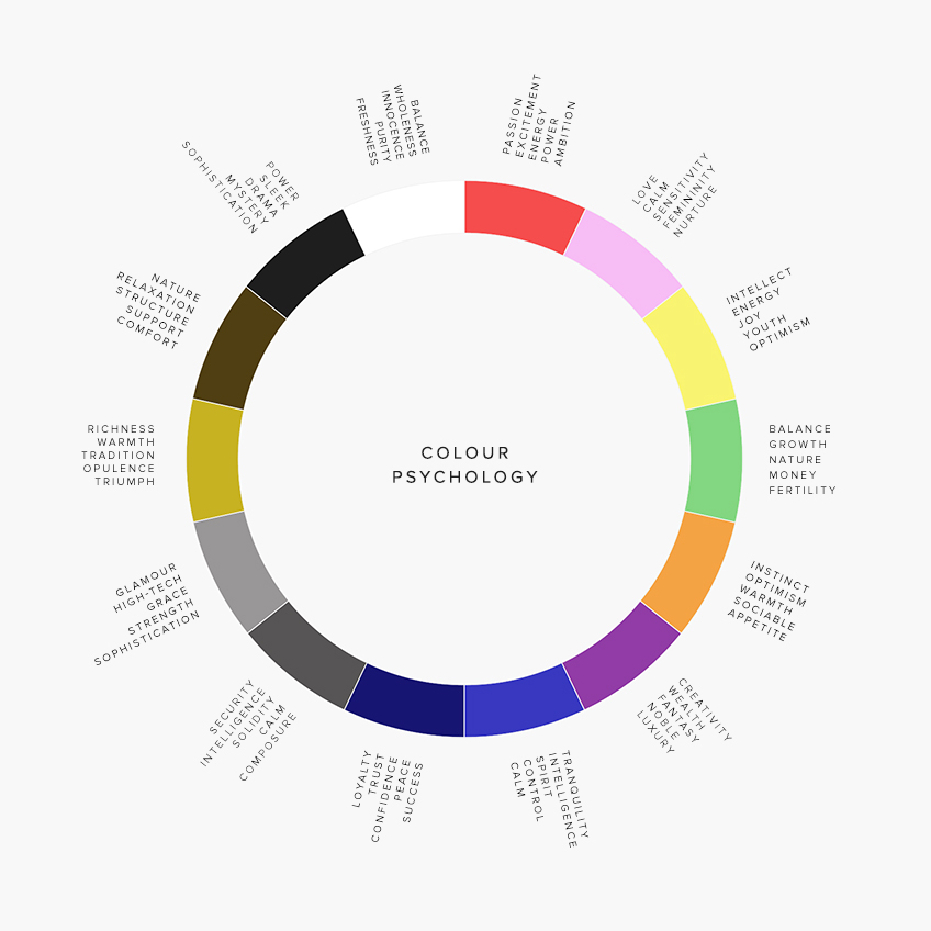
colors and emotions!
The psychology of red
Red is the first recognizable color for babies. As one of the brightest colors of the day, it attracts a lot of attention. The color red has a wide range of meanings, but they are all associated with energy and power. Depending on the concept, it can be about love and passion or anger and danger. Since this color stimulates high tension, using too much of it may be tiring for the eyes and even cause anxiety. Red color should be used wisely in your designs!
The psychology of blue
Blue is the color of trust and stability, which is often associated with reliability and competence. It is very popular in business and banking software. However, compared to warm colors, blue may seem dull.
The psychology of yellow
Yellow will forever be associated with the sun. It is the color of friendship and happiness and can be very inspiring. However, according to the principles of color psychology, excessive use of yellow color can lead to negative perception and create fear in people.
The psychology of green
Green is strongly associated with nature. It is called the color of balance and harmony. This color is also associated with youth, growth and renewal. The color green is often used in designs related to “green” topics: the environment, sustainability, environmental protection, and healthy food.
The psychology of purple
For a long time, purple was a rare pigment, so only the wealthy could afford it. This historical background strongly associated it with luxury, royalty, and monopoly. It mixes the energy of red and the reliable balance of blue, but can be distracting when overused.
The psychology of brown
Brown is associated with earth and forest. Because of its natural origin, brown is considered the color of security, protection, comfort and stability, and is often used as a background color.
The psychology of orange
Orange is said to combine the power of red and the joy of yellow, so it is an energetic and positive color. Orange is associated with motivation, vitality and enthusiasm. Also, it is often used in design to create feelings of fun and adventure.
The psychology of pink
Pink is the color of love, intimacy and sensitivity. Historically, this color is associated with the female gender and is strongly associated with youth, sophistication and femininity. As a result, pink is the color of choice when considering color psychology for products and brands targeting girls and young women.
The psychology of black
Black, like red, has a wide range of meanings, from tragedy to mystery, from tradition to innovation. It usually goes well with any color. It is useful in creating contrast, so it is popular as a background color, especially for web and mobile interfaces based on visual content. Black is often associated with exclusivity and prestige.
The psychology of white
White has long conveyed the meanings of innocence, purity and clarity. It is often associated with a blank sheet of paper or an untouched canvas that engages one to generate new ideas. However, excessive use of white can also lead to reactions such as emptiness and loneliness. White, a popular background color, adds space to interfaces and creates a solid foundation for readability.
The psychology of gray
Gray is often on the cool end of the neutral color spectrum. Using a variety of shades of gray in design creates a sophisticated and elegant look because it makes other colors stand out.
Psychology of colors according to demographics
When choosing colors, paying attention to demographics is very important. Color perception and psychology varies by gender, age, and culture, so it’s important to consider the demographics of your users.
Color preferences based on gender
Gender has a huge impact on color preference and color psychology, so it’s important to know and understand the differences. The Color Assignment research group conducted one of the most well-known studies, which is summarized below:
Cool colors > Warm colors: Additionally, both genders prefer blue, green, and their respective colors.
Blue is the #1 color for all genders: Both men and women chose blue as their favorite color. Women also show more interest in different shades of blue.
Brown and orange are not so popular: brown is less popular among men, while orange is the least popular among women.
Color preferences based on age
The age of your audience is also a factor in determining the choice of color. Children usually like warm colors like yellow and orange. According to the book Psychology of Color and Color Therapy, as people get older, they prefer cooler colors to warm colors. In addition, children are more likely to change their color preferences because their tastes are not well defined, while adults tend to stick to their favorite colors.
Color preferences based on culture
Culture has a major influence on color psychology, so be sure to consider this when choosing your color scheme. Let’s explore some key findings below.
Blue is considered a masculine color in the West, but the Chinese consider blue a feminine color.
In Chinese culture, white represents death and bad luck, while orange is associated with health.
Yellow symbolizes holiness and commerce in Hinduism.
In Latin America, red symbolizes war and earth
Where to find colors for web design?
If you want to use gradient colors, the uigradients site is one of the best sources. you can easily choose the color range you want and use it in the design of the site, while this site has the color range that famous brands like Instagram also uses them, and you can easilyfind darker shades of colors.
One of the best resources for choosing colors from which you can choose beautiful and standard colors is the flatuicolors website. Using this site is very simple, just choose your color palette and then click on the desired color to copy its color code. now you can paste it anywhere you want.


Leave feedback about this
You must be logged in to post a comment.